Mastering CSS Flexbox: An Interactive Guide to Responsive Web Layouts
Learn the fundamentals of Flexbox and how to create responsive web layouts that adapt to different devices and screen sizes with interactive examples.
Introduction
Cascading Style Sheets (CSS) is a language used to style and Layout web pages. It allows developers to apply styling to HTML elements such as fonts, colors, and layouts. Flexbox is a layout mode provided by CSS3 that provides an efficient way to layout, align and distribute space among items in a container. In this article, we will discuss the basics of CSS Flexbox and its properties with interactive examples.
Flexbox, short for Flexible Box Layout, is a layout module in CSS that allows for the creation of flexible and responsive layouts. It is a one-dimensional layout model, meaning it deals with either columns or rows, rather than both at the same time like the Grid layout. With Flexbox, we can align and distribute items within a container along the main axis (horizontal) and cross axis (vertical), making it easy to create complex and dynamic layouts. Flexbox provides a powerful and intuitive way to structure web pages, especially in cases where the design needs to adapt to different screen sizes and devices.

Flexbox Container and Items
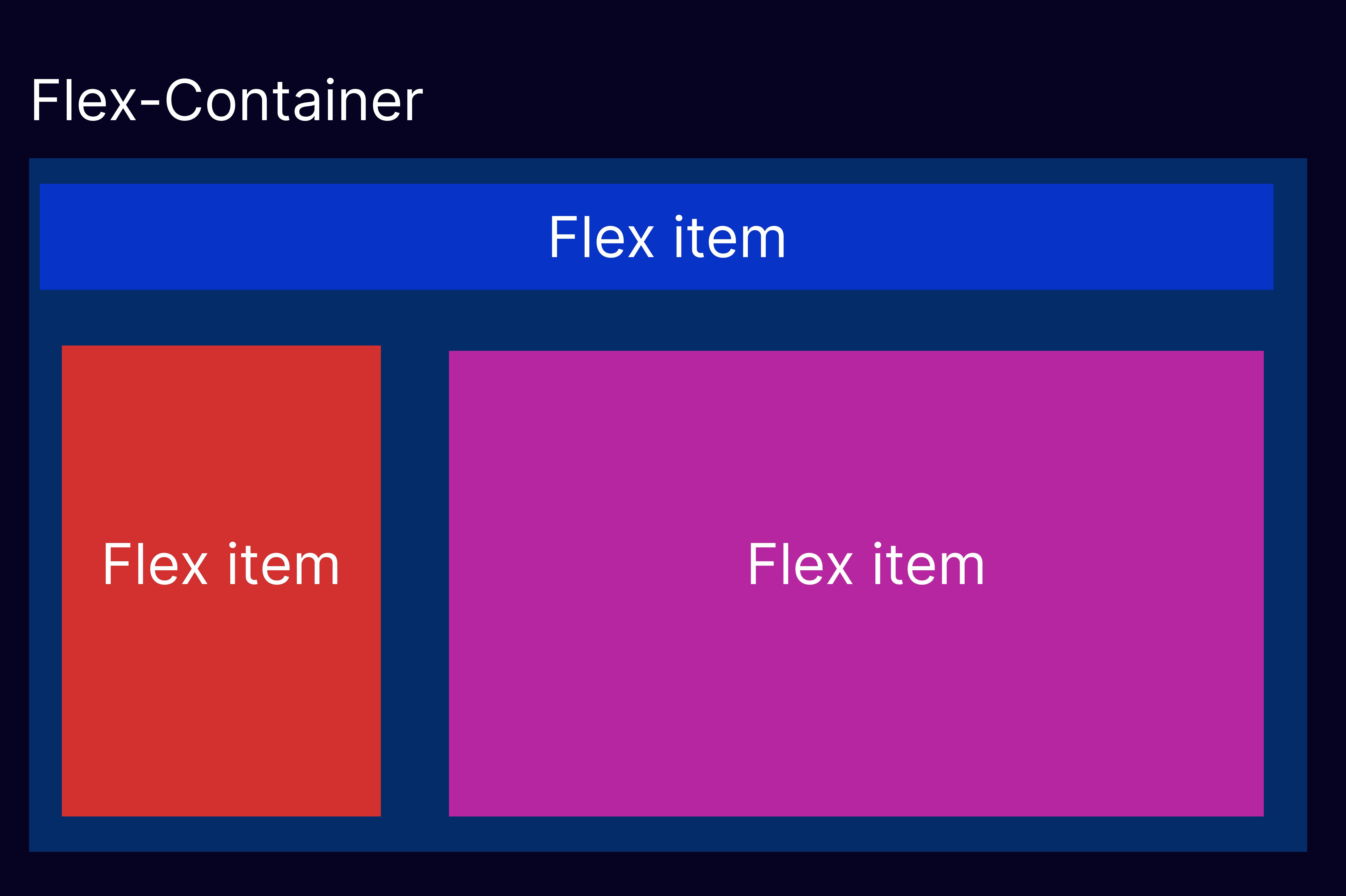
In the Flexbox layout, we have a container that holds a group of flex items. The container is known as the flex container and the items are known as flex items. The direction of the flex container is defined by the flex-direction property. The default value is row, which means that the items are laid out horizontally in a row.
To create a flex container, we can add the display property with the value of flex or inline-flex to the parent element of the flex items.
.container {
  display: flex;  /* there is also a display: inline-flex; */
}
Flexbox Direction
The flex-direction property is used to define the direction of the main axis of the flex container. The main axis is the primary axis along which the flex items are arranged. The default value of flex-direction is row. Other possible values are column, row-reverse, and column-reverse.
.container {
  flex-direction: row; /* this is default value */
  flex-direction: column;
  flex-direction: row-reverse;
  flex-direction: column-reverse;
}
Flexbox Justify Content
The justify-content property is used to align the flex items along the main axis. This property distributes the extra space in the flex container. The default value of justify-content is flex-start, which means that the items are aligned to the left of the container.
.container {
  justify-content: flex-start; /* default value */
  justify-content: flex-end;
  justify-content: center;
  justify-content: space-between;
  justify-content: space-around;
  justify-content: space-evenly;
}
Flexbox Align Items
The align-items property is used to align the flex items along the cross axis. The cross axis is the secondary axis perpendicular to the main axis. The default value of align-items is stretch, which stretches the items to fill the container along the cross-axis.
.container {
  align-items: stretch; /* default value*/
  align-items: flex-start;
  align-items: flex-end;
  align-items: center;
  align-items: baseline;
}
Flexbox Flex Wrap
The flex-wrap property is used to control whether the flex items wrap to the next line when there is not enough space in the container. The default value of flex-wrap is no-wrap, which means that the items are laid out on a single line.
.container {
  flex-wrap: nowrap; /* default */
  flex-wrap: wrap;
  flex-wrap: wrap-reverse;
}
Flexbox Flex Flow
The flex-flow property is a shorthand property for flex-direction and flex-wrap. It allows us to set both properties at once.
.container {
  flex-flow: row nowrap; /* default */
  flex-flow: column wrap;
  flex-flow: row-reverse wrap-reverse;
}
Flexbox Align Content
The align-content property is used to align the flex lines when there is extra space in the container. It only applies when there are multiple lines of flex items. The default value of align-content is stretch, which stretches the lines to fill the container.
.container {
  align-content: stretch; /* default */
  align-content: flex-start;
  align-content: flex-end;
  align-content: center;
  align-content: space-between;
  align-content: space-around;
  content-content: space-evenly;
}
FlexBox Gap
The gap property is a new addition to the Flexbox layout in CSS, which allows you to add space between the flex items. It is similar to the grid-gap property used in CSS Grid layouts.
Prior to the gap property, designers had to manually add margins or padding to the flex items to create space between them. The gap property simplifies this process and provides a more efficient way to add space between items
.container {
  gap: 20px;
}
FlexBox Order
Certainly! The order property in Flexbox allows you to specify the order in which the flex items are displayed within the container, regardless of their position in the HTML markup.
The order property takes an integer value, and the lower the number, the earlier the item will be displayed. So, in this case, we've set the order of the second item to 3 and the order of the fourth item to 1, which means that the fourth item will be displayed first and the second item will be displayed last.
We've also added some additional CSS to demonstrate how to use the nth-child selector to set a different order value for every other flex item. In this case, we've set the order of every odd-numbered flex item (1, 3, 5) to 2, which means that they will be displayed after the even-numbered items (2 and 4).
Here's an example:
.item {
  background-color: lightblue;
  width: 200px;
  height: 200px;
  margin: 10px;
}

.item:nth-child(odd) {
  order: 2;
}
Flex-grow and Flex-shrink
Certainly! flex-grow and flex-shrink are two important properties in Flexbox that control how the flex items grow or shrink to fit the available space in the container.
flex-grows specifies how much an item should grow in relation to the other items in the container, while flex-shrink specifies how much an item should shrink in relation to the other items in the container when there is not enough space.
.item {
  background-color: lightblue;
  height: 150px;
  margin: 10px;
}

.item:nth-child(odd) {
  flex-shrink: 1;
}
In this example, we have a Flexbox container with five flex items inside. We've added the flex-grow property to each item to specify how much it should grow in relation to the other items in the container.
We've set the flex-grow value of the second item to 2, the third item to 2, the fourth item to 3, and the fifth item to 1. This means that the fourth item will grow the most, followed by the second item, the third item, and finally the first and fifth items.
We've also added some additional CSS to demonstrate how to use the flex-shrink property to control how much an item should shrink when there is not enough space. In this case, we've set the flex-shrink value of every odd-numbered flex item (1, 3, 5) to 1, which means that they will shrink more than the even-numbered items when there is not enough space.
Flexbox Basis
The flex-basis property specifies the initial size of the item before any remaining space is distributed. The default value of flex-basis is auto, which means that the item will be sized based on its content.
.item {
  flex-basis: 100px;
}
Flexbox Align Self
The align-self property is used to align a single flex item along the cross axis, overriding the align-items property of the flex container. This property only applies to a single flex item.
.item {
  align-self: flex-start;
}
Interactive Examples
Here are some interactive examples of CSS Flexbox that demonstrate the various properties and concepts we discussed above:
CodePen: CSS Flexbox Playground - A simple playground that allows you to experiment with the different properties of CSS Flexbox.
Flexbox Froggy - A game that teaches you the basics of CSS Flexbox by helping a frog reach its lilypad using Flexbox properties.
CSS-Tricks: A Complete Guide to Flexbox - A comprehensive guide to Flexbox with examples and interactive demos.
Conclusion
CSS Flexbox provides an efficient way to layout and align items in a container. The Flexbox model allows us to create responsive layouts that adjust to different screen sizes and devices. By understanding the various properties and concepts of CSS Flexbox, we can create more flexible and maintainable layouts for our web projects.
